10 Examples of Online Stores with Great Design

When it comes to design, there are some online stores that stand out above the rest. Their sites are attractive and easy to use, making online shopping a pleasant experience.
With online shopping, we have the disadvantage of not being able to touch the products before buying them, so design and functionality become key elements in creating an online store.
If you’re new to virtual shopping or if you’re looking for some online store designs that you might find appealing, there are several site ideas to check out.
Casa Decor
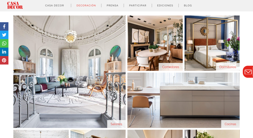
The first online interior decoration store in Mexico is designed with a very particular aesthetic; the dominant color is black and white (with some touches of cream), and its products are divided by themes.
It’s one of the most attractive and elegant sites on the market for its category.
IKEA
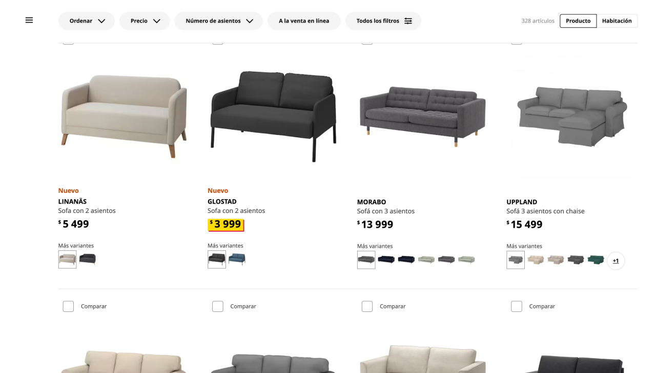
Everyone should know the Swedish furniture store (or at least have heard of it), and we can see that this store is no exception. Its products are organized by sections, and the design is quite attractive (although some may find it boring).
It is one of the most popular online stores that exist; its website is intuitive and easy to use. The online shopping experience reflects the best possible way to acquire their products.
This store is designed with simple colors; everything is easy to follow, and the instructions are clear for anyone. The homepage has a search bar, categories, and filtering options.
Amazon
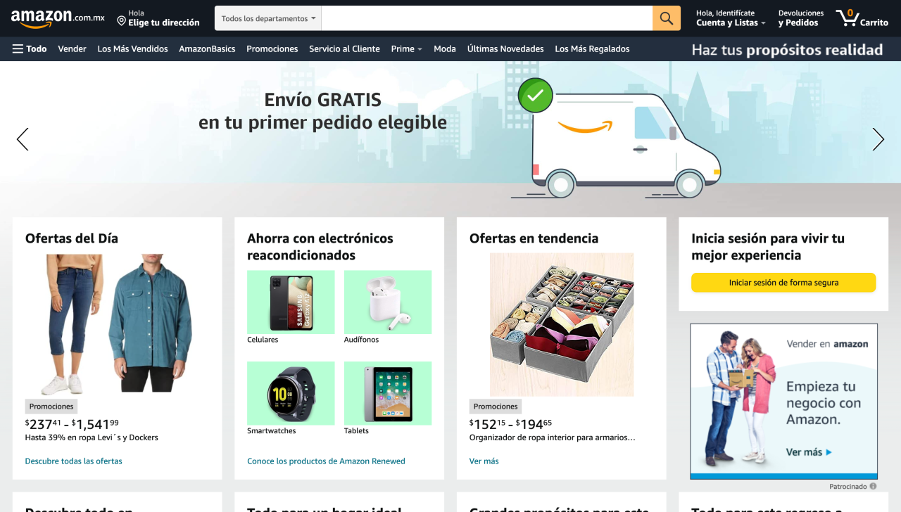
It’s no surprise that Amazon is on the list. Its website is simple and easy to use, making it ideal for buying products online.
The world’s largest online store is designed with a simple and clear interface; the products fit well on the page and don’t feel cramped.
Of all the examples we will discuss, this one is the most challenging as Amazon is more like a web of multiple stores where practically everything is sold, but despite that, they have managed to use simplicity effectively.
The store has a very clean design, the product lists are simple, and the filter works very well.
Zara
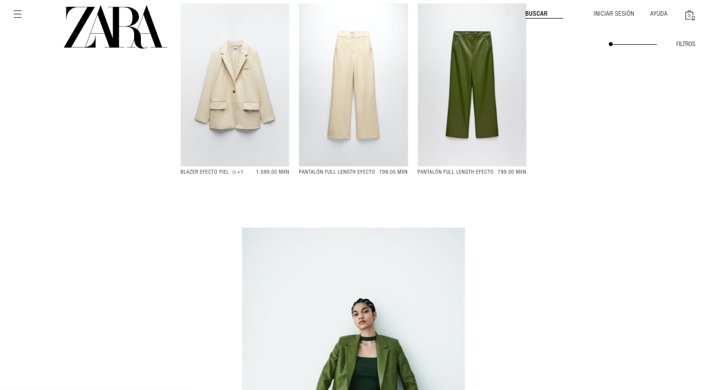
Zara’s online store is very similar to the physical one, using black and white colors for all elements of the website.
The Zara online store is a site that offers an attractive and easy-to-use user experience. Its main pages are in light and clear colors, creating a luxurious atmosphere.
Its product pages are useful and easy to use, with clear images and colors that highlight its products.
H&M
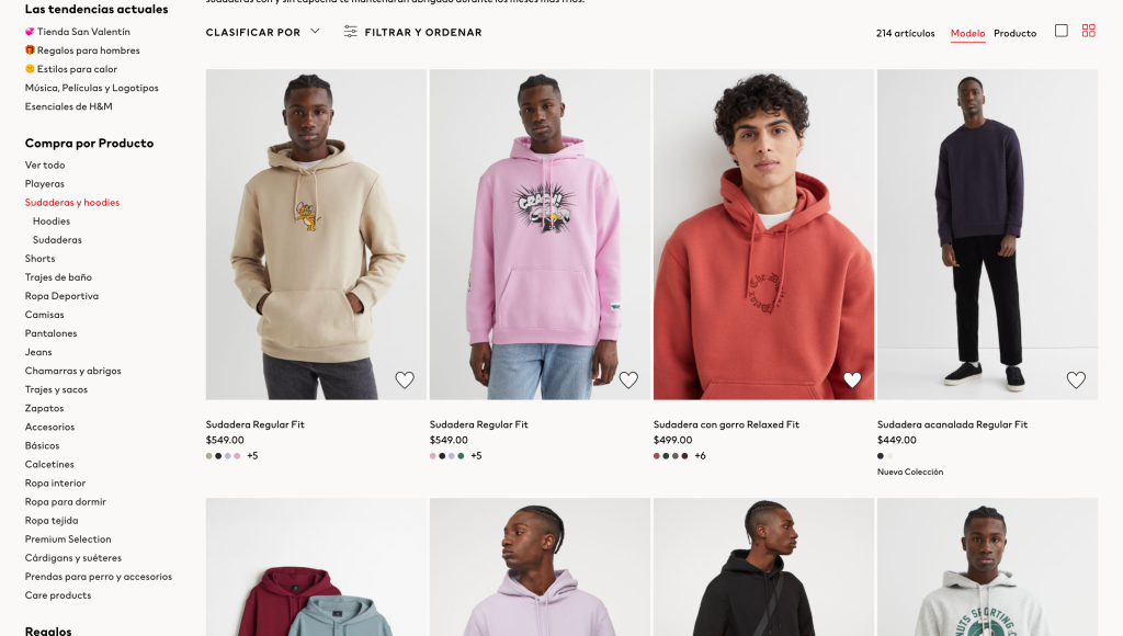
Their physical stores give us a hint about how their online store is: a simple and clear design. The H&M online store is a pleasant and easy to use site.
Each section has its own background image that gives it a unique look and immediately associates it with the brand. Its main pages are clear and have large images that immerse the visitor in the brand’s environment.
Apple
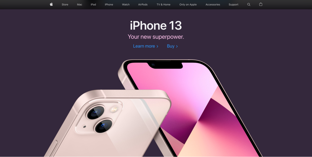
Apple’s online store is the closest thing to what we might consider “a perfect online store”; its products are organized by sections, and the design is impeccable.
The design of the Apple online store is recognizable to everyone. It’s clean, simple, and easy to navigate. All the products are clearly organized, and there is plenty of useful information about each one of them.
If there’s something Apple excels at, it’s creating digital experiences.
Nike
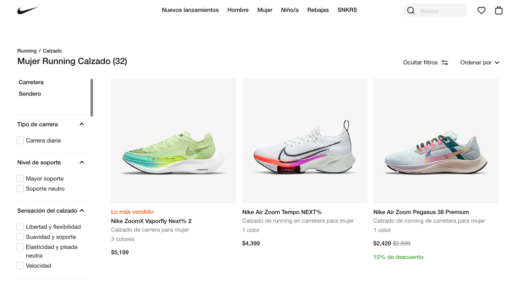
Nike is a classic example of effective web design. Their site features an incredible selection of products, along with many useful features.
It has a clean and easy-to-use design, with a lot of information about each product. The homepage has many links to various sections, allowing visitors to explore the entire site.
Their website is based on the color black; each page has a black background, giving it a sophisticated look.
The products are organized by categories and can be easily filtered. They use large images of their products, allowing us to see them up close and determine if the quality is right for our needs.
eBay
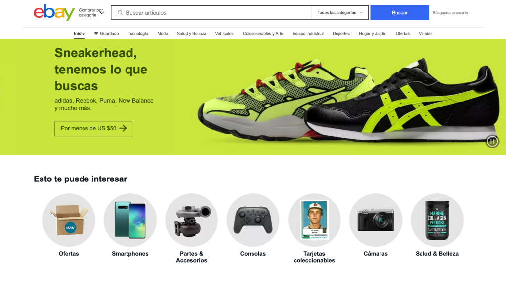
The interface isn’t as attractive but works quite well, creating a simple and easy-to-use design.
eBay may not be on par with some of the online stores mentioned earlier, but the design of their website is attractive and easy to use.
The online store has a design that can be classified as “vintage.” Its pages are filled with large images, bright colors, and product lists.
Nordstrom
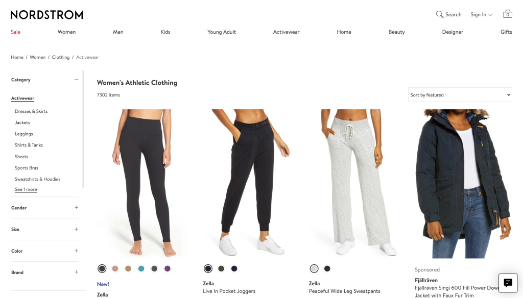
Their online store is extremely attractive; the design is based on the color black and uses various types of images.
The online store’s design resembles the physical one, meaning it focuses on providing excellent service rather than on external appearance.
It has an elegant and sophisticated design, with eye-catching images. Their product pages are clear and easy to use, allowing us to see all the details of each item.
Walmart
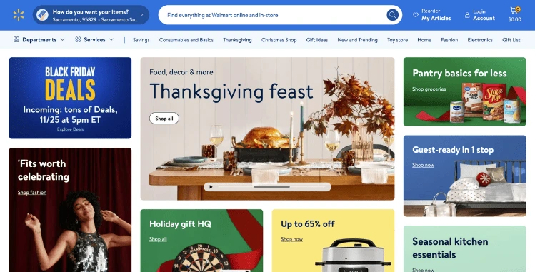
Walmart has a fairly simple design that uses pastel colors.
The interface is clear and easy to use. Its main pages are filled with images, making it attractive to the user. It also includes a wide variety of products, making it a good choice for those looking for a store where they can buy everything.
Online stores are becoming an increasingly popular alternative for purchasing products, mainly due to the convenience they offer. However, not all online stores are the same, and some have a much more attractive design than others.
Most of them focus on visual design, which makes it very appealing to the user. There are also some stores that focus on customer service, allowing them to offer a much better shopping experience.
Although all the mentioned stores are excellent, each one has its own unique features. You can use them as a base and experiment for yourself with how navigation is on them; you’ll likely come up with ideas to implement in your own project.


